

**Top 5 Sherwin-Williams Interior Colors for a Timeless and Trendy Home**
- rprcontractors
- Dec 6, 2024
- 3 min read
Choosing the perfect interior paint color can transform your space, setting the mood and reflecting your personal style. Sherwin-Williams, a leader in the paint industry, has curated an exceptional palette of colors that are both timeless and on-trend. If you’re ready to give your home a fresh look, here’s a deep dive into Sherwin-Williams’ top five interior colors that designers and homeowners are loving right now.
---
### **1. Alabaster (SW 7008)**
**Perfect for:** Brightening any space with a warm, neutral touch.

Alabaster has remained a top choice for years, and it’s easy to see why. This soft, creamy white provides the perfect balance between warm and cool tones, making it versatile for virtually any room. Whether you’re looking to create a serene living room, an inviting entryway, or a spa-like bathroom, Alabaster delivers timeless elegance.
It’s particularly beloved for its ability to pair seamlessly with bold accents or natural materials like wood and stone. Pro tip: Use Alabaster on walls with contrasting black or dark gray trim for a modern, sophisticated look.
---
### **2. Agreeable Gray (SW 7029)**
**Perfect for:** A neutral that never feels boring.
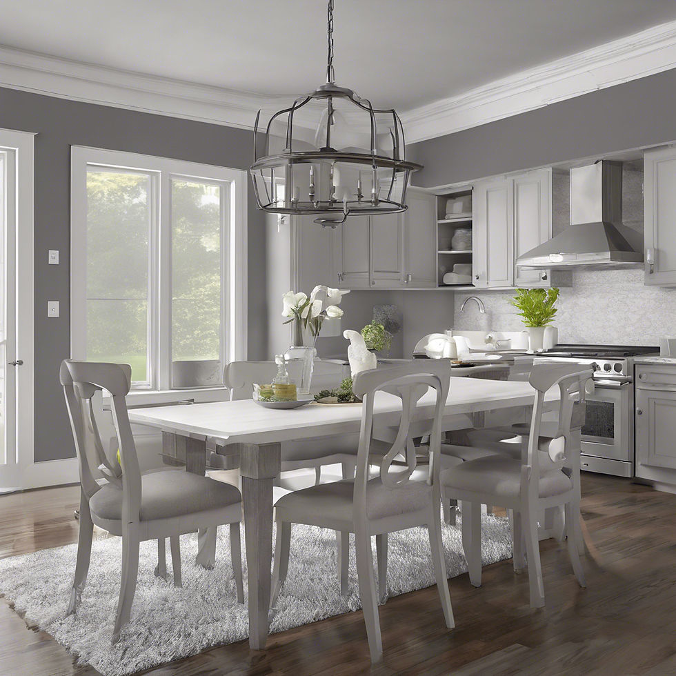
Agreeable Gray is the go-to greige (gray-beige) color that works wonders in every room. It’s warm without being overpowering, cool without feeling sterile, and complements a wide variety of design styles—from modern farmhouse to traditional.
One of the reasons this color is so popular is its chameleon-like quality; it adapts to different lighting conditions. In rooms with lots of natural light, it leans more toward a warm gray, while in dimmer spaces, its beige undertones shine through. Pair it with white trim for a crisp, polished look.
---
### **3. Naval (SW 6244)**
**Perfect for:** Adding drama and sophistication.
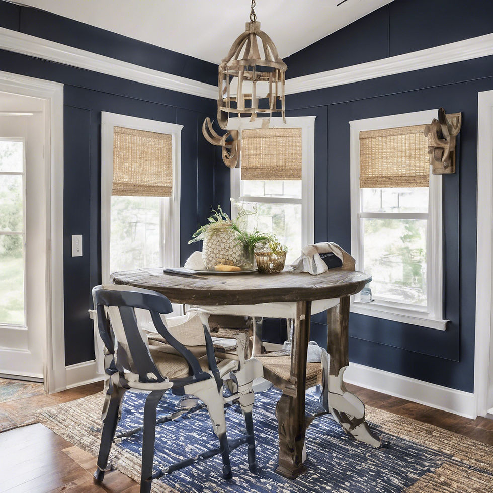
For those who want to make a bold statement, Naval is your go-to. This deep navy blue is rich, luxurious, and surprisingly versatile. Use it as an accent wall in a bedroom, a striking choice for kitchen cabinets, or a bold color for an office that inspires productivity.
Despite its depth, Naval has an elegance that makes it feel timeless rather than trendy. Pair it with gold or brass fixtures for a stunning contrast, or soften it with neutral furniture and decor for a cozy yet elevated vibe.
---
### **4. Repose Gray (SW 7015)**
**Perfect for:** A soft, adaptable neutral for any room.

Repose Gray is another fan-favorite neutral that works beautifully across a variety of spaces. With subtle undertones of beige and a hint of warmth, it provides a cozy, welcoming feel without dominating the room.
This color is a fantastic choice if you want something neutral but with a bit more personality than a stark white or standard gray. It’s especially popular in open-concept homes because it transitions effortlessly between spaces. Pair it with muted blues or greens for a calming palette, or use it as a backdrop for bold, colorful accents.
---
### **5. Urbane Bronze (SW 7048)**
**Perfect for:** A sophisticated, earthy vibe.

Named Sherwin-Williams’ 2021 Color of the Year, Urbane Bronze continues to shine as a favorite for those looking to ground their spaces. This deep, warm bronze leans into earthy tones, creating a cozy, inviting atmosphere.
It’s a standout choice for accent walls, trim, or even entire rooms if you’re feeling adventurous. Pair it with natural materials like leather, wood, or stone to emphasize its organic, rooted feel. For a lighter contrast, try it alongside soft whites like Alabaster or creamy off-whites like Shoji White.
---
### **How to Choose the Right Color for Your Space**
When selecting an interior color, think about the room’s lighting, size, and purpose. Natural light can dramatically affect how a color appears, so be sure to test a sample on your wall before committing. Additionally, consider pairing your chosen color with complementary tones for trim, furniture, and decor.
Sherwin-Williams offers peel-and-stick color samples, which make it easy to test how these colors look in your space without any mess or hassle.
---
### **Final Thoughts**
Sherwin-Williams’ top interior colors—Alabaster, Agreeable Gray, Naval, Repose Gray, and Urbane Bronze—represent a perfect mix of timelessness and modern trends. Whether you’re looking for a serene retreat, a bold statement, or a versatile neutral, these colors have you covered.
Ready to refresh your space? Head to your nearest Sherwin-Williams store or visit their website to explore these colors and more. A fresh coat of paint is one of the easiest ways to breathe new life into your home, and with these top picks, your space is sure to feel stylish and inviting!
Which of these colors are you most excited to try? Let us know in the comments!

Trusted by homeowners for over 30 years in Phoenixville, Royersford, Pottstown, PA and surrounding areas to patch and paint their homes. Visit www.rprcontractors.net for exclusive deals or reach out to us at 484-949-5258. 63 5-star ratings ⭐️⭐️⭐️⭐️⭐️ on Angi, HomeAdvisor, and Google.


Comments